2024 | mobile app
Designing a networking app for women


Quick look (TL;DR)
Quick look (TL;DR)
Amelia is a career-focused networking platform designed to help women move beyond transactional LinkedIn requests and into meaningful, in-person professional relationships. As the platform expanded across Toronto, Vancouver, and NYC, the business needed to transition from a static web directory into a dynamic mobile app that facilitates real-time interaction for live events.
The app did not launch, however, I'll go through what work I completed.
My role
I spearheaded multiple end-to-end features that would transition the platform from web-based to a native iOS/Android experience.
I spearheaded multiple end-to-end features that would transition the platform from web-based to a native iOS/Android experience.
End-to-end ownership
Defined the user flow and interface for core features, including event discovery, creation and messaging.
Defined the user flow and interface for core features, including event discovery, creation and messaging.
Design system
Developed a foundational, scalable component library to help with design-to-engineering workflow.
Developed a foundational, scalable component library to help with design-to-engineering workflow.
Brand evolution
Translated the existing web identity into a mobile-first visual language, including custom App Store assets.
Translated the existing web identity into a mobile-first visual language, including custom App Store assets.
The challenge and defined success metrics
Problem
The web platform functioned primarily as a directory—a "digital sign-up form" with high churn. While users were interested in the community, the lack of mobile-first engagement tools meant that once a user signed up for an event, they had no reason to return to the platform. We were losing the opportunity to facilitate organic networking the brand represents.
The web platform functioned primarily as a directory—a "digital sign-up form" with high churn. While users were interested in the community, the lack of mobile-first engagement tools meant that once a user signed up for an event, they had no reason to return to the platform. We were losing the opportunity to facilitate organic networking the brand represents.
Retention
Transitioning from "one-off" event sign-ups to weekly active usage via community features.
Transitioning from "one-off" event sign-ups to weekly active usage via community features.
Engagement depth
Increasing session frequency by providing utility-driven features.
Increasing session frequency by providing utility-driven features.
Scalability
Delivering a visual revamp and component library that would allow the team to ship new features faster.
Delivering a visual revamp and component library that would allow the team to ship new features faster.
Understanding the problem
To validate our mobile-first hypothesis, we conducted a series of user interviews and usability tests of the existing web experience and low-fidelity prototypes of the upcoming mobile app. We didn't just ask what users wanted, but where the friction occurred.
To validate our mobile-first hypothesis, we conducted a series of user interviews and usability tests of the existing web experience and low-fidelity prototypes of the upcoming mobile app. We didn't just ask what users wanted, but where the friction occurred.
Features I led
Searching for events
The legacy, web experience
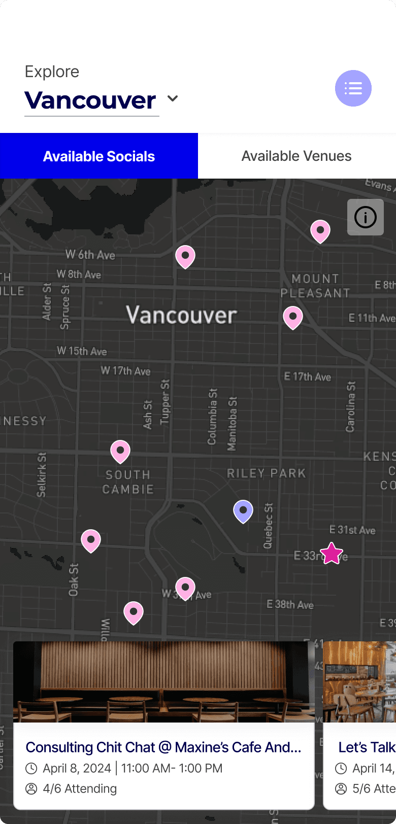
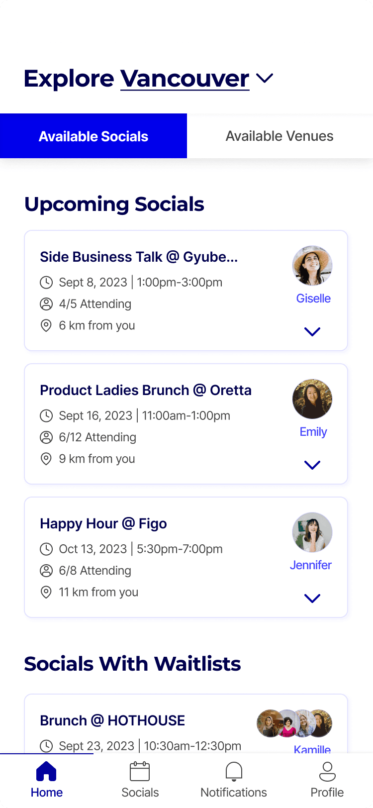
The original web platform relied exclusively on a map-based discovery feed. While visual, this forced a high cognitive load on users, requiring them to click individual pins to find out basic event details. There was no way to quickly scan for relevance.
The original web platform relied exclusively on a map-based discovery feed. While visual, this forced a high cognitive load on users, requiring them to click individual pins to find out basic event details. There was no way to quickly scan for relevance.
Mobile solution- Dual-view discovery
I introduced a flexible map vs. list toggle. This allowed users to choose their discovery mode based on their immediate intent:
Map View: Map view: Ideal for geographic convenience and events near the user
List View: Optimized for rapid scanning of event titles, dates, and topics
I introduced a flexible map vs. list toggle. This allowed users to choose their discovery mode based on their immediate intent:
Map View: Map view: Ideal for geographic convenience and events near the user
List View: Optimized for rapid scanning of event titles, dates, and topics
Creating/hosting events
The legacy, web experience
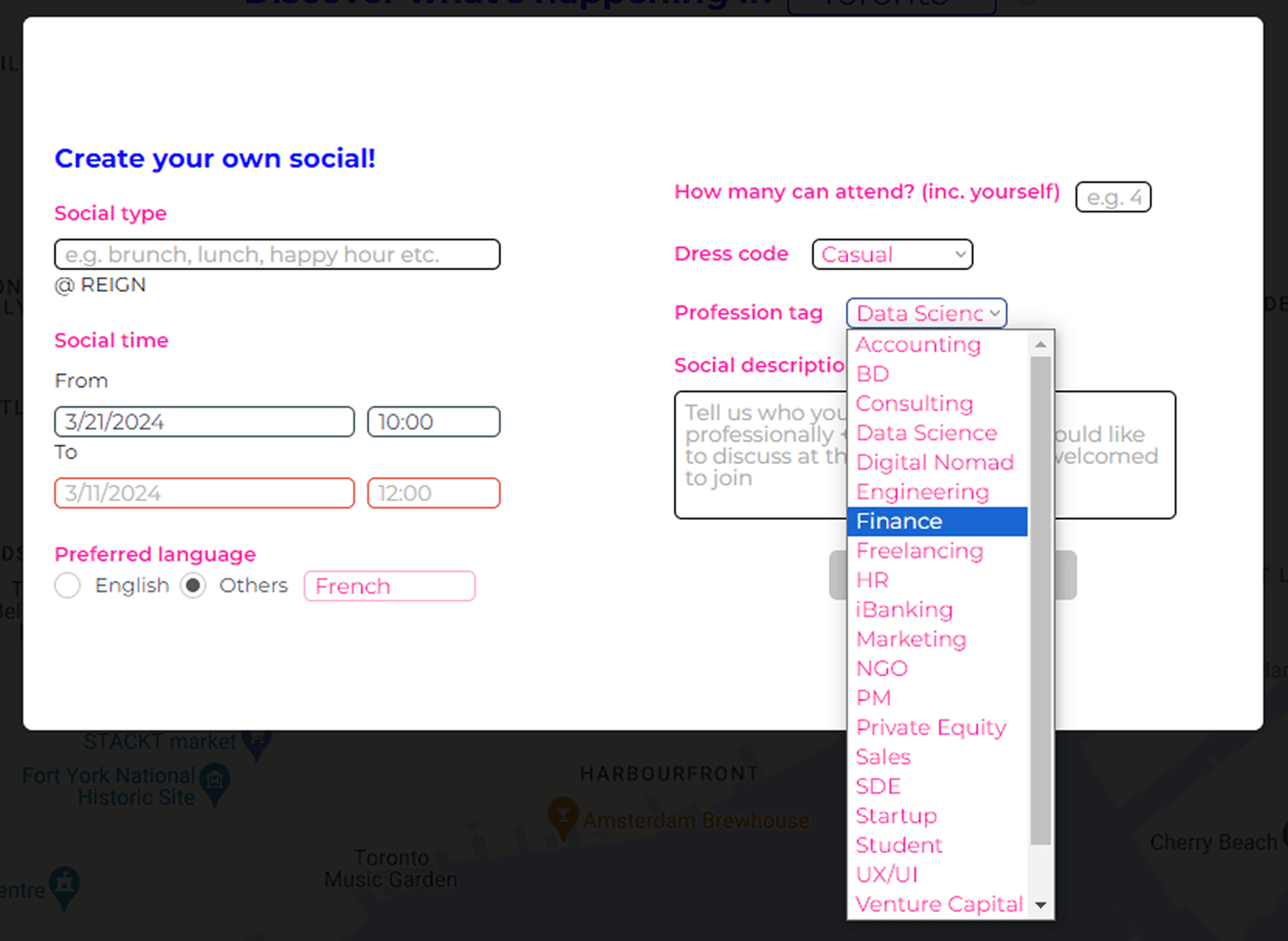
The original "Create Your Own Social" flow was a single, long-form entry that published events immediately.
User research revealed a critical operational gap: 8% of hosts forgot to confirm physical venue reservations after posting online. This led to last-minute cancellations and date changes, which eroded attendee trust and damaged the platform's reliability.
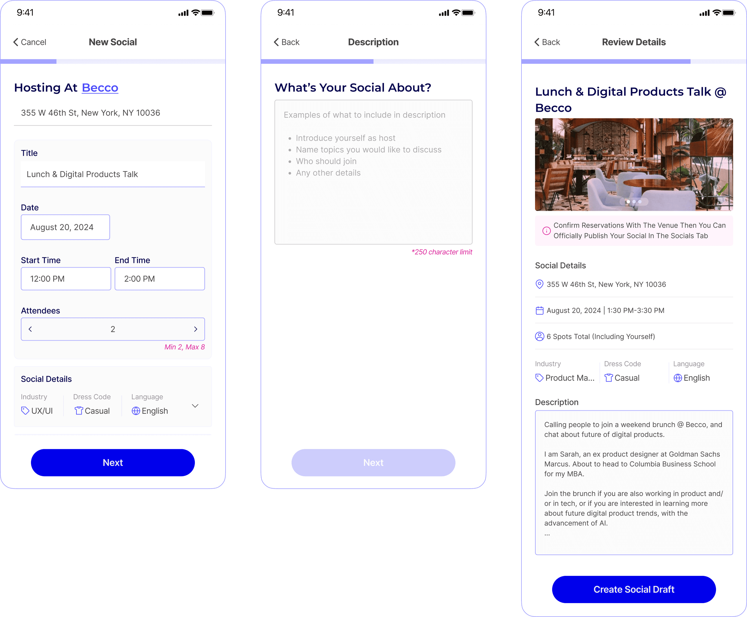
Mobile solution- The social draft + Multi-step onboarding
To bridge the gap between digital planning and reality, I moved away from the single-form model and introduced:
12-Hour Verification Window: A mandatory draft state ensuring hosts finalize venue logistics before an event goes public—protecting platform reliability
Progressive Disclosure: Broke the form into a multi-step mobile flow to reduce cognitive load and prevent drop-off
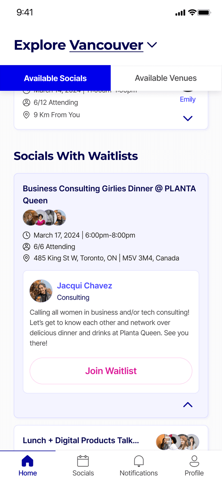
Waitlist scenarios
The legacy, web experience
Web lacked clear differentiation between available and full events. During usability testing, we observed participants sifting through individual pins only to discover a "Social" was full—increasing time-to-task and causing user frustration.
Web lacked clear differentiation between available and full events. During usability testing, we observed participants sifting through individual pins only to discover a "Social" was full—increasing time-to-task and causing user frustration.
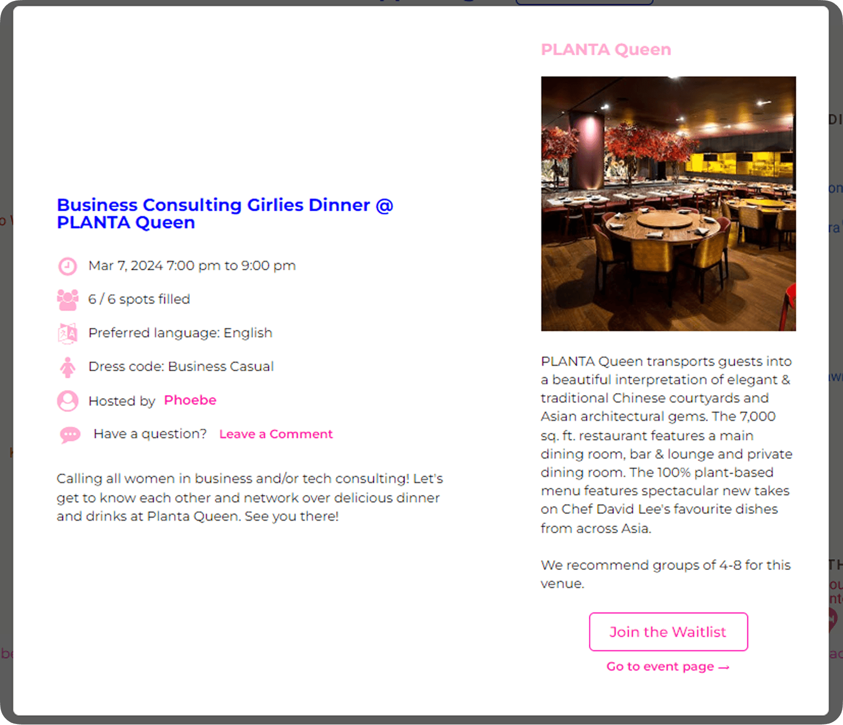
Mobile solution- Dedicated waitlist management
To streamline the browsing experience, I introduced a clear availability hierarchy:
Waitlist categorization: Established a dedicated section for "Socials with Waitlists" beneath active events, allowing users to differentiate at a glance
To streamline the browsing experience, I introduced a clear availability hierarchy:
Waitlist categorization: Established a dedicated section for "Socials with Waitlists" beneath active events, allowing users to differentiate at a glance
The mobile app has yet to launch.