

Quick look (TL;DR)
Impact
Improved the quote-to-purchase conversion rate and by empowering users with self-service tools.
56%
Engagement with the marketing site search tool, driving leads into quote funnel.
2.9x
Lift on Auto checkout completion by allowing late stage discount application.
2.1x
Lift on Property checkout completion by allowing late stage discount application.
Summary
Problem
Prospective users weren't converting into the quote flow because there wasn't a way to verify their group savings upfront. Additionally, users who missed the discount field during the initial application would be forced to restart the entire process to apply savings, leading to high abandonment rates.
The goal was to scale Sonnet's customer base by targeting high-loyalty, partner segments. By improving the clarity of discount eligibility and removing friction at both the top and bottom of the funnel, we attract and encourage ideal customers to purchase.
Part 1: Group Discount Search
I designed a search tool that could be easily leveraged across high-traffic landing pages, enabling customers to search and verify their group eligibility prior to entering the quote flow and filling out any personal data.
An interactive search tool that handles 2000+ partner groups was ideal amongst heavy text pages.

Understanding the problem
To understand our group discount landscape, an initial customer journey workshop was held with the team to brainstorm how we could raise awareness of partner discounts early on the marketing site.
Later I conducted research, including reviewing metrics of our high-traffic landing pages, an analysis of competitor offerings, and any platform (CMS) constraints.

Due to capacity and timelines, we removed data passing which would eliminate duplicate data entry between the landing page search widget and the quote funnel discount component.
With the requirement to re-use existing logic, removed rigid "exact-match" logic (e.g. users typing "U of T" vs. "University of Toronto") which could help reduce search failure rates.
Concepts that didn't work out
I evaluated our existing component library and the scalability of existing and upcoming features to determine if we could extend current logic or create something net-new.


Launch
When the search tool launched it was placed on 4 of our partner + offer pages to begin with. Over a one month tracking period, we found of the users that came across the search tool- 56% searched a group and clicked our call-to-action to start a quote.

Part 2: Group Discount Reminder
Initial Group Discount
There's an existing, initial 'group discount' tool in the beginning of the application flow. How it works differently is users are prompted to:
Select a group category
Input their information + add discount
Pain points
Category pill wasn't intuitive to users. When reviewing user sessions, I saw customers rage click or skip past the feature due to a misunderstanding of which category their group belonged to.
For research, I analyzed how users interacted with the tool using behavioural platform, used that data to figure out feature placement in the flow and within the page, and completed an analysis of how our competitors surfaced their discount tool.
Understanding the flow
I analyzed how users interacted with the tool using a behavioural platform. Took the observed patterns and insights to narrow down the flow and page placements.

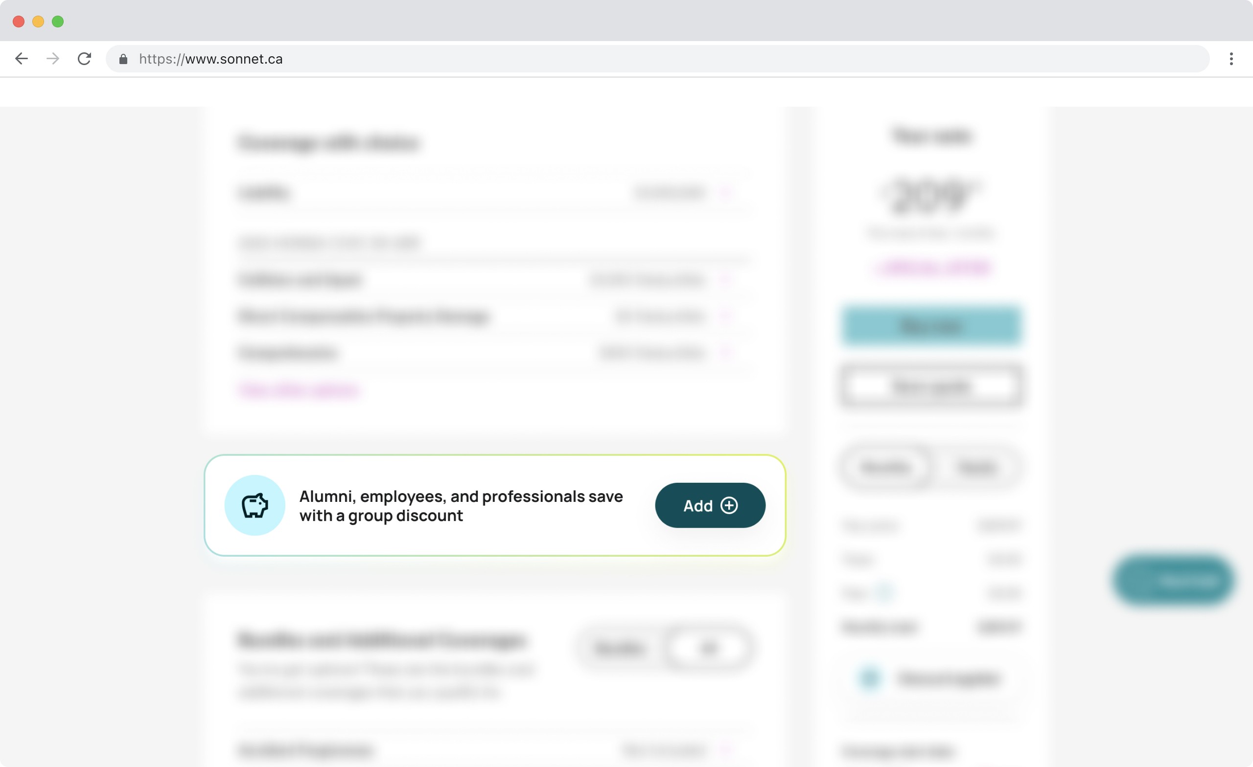
Applying a discount late in the funnel triggers a price re-calculation. To ensure a fast, seamless experience and minimize backend load for engineering, we placed the reminder on the 'Customize Coverages' page—the natural point where users are already evaluating their final price and editing their policy.
While Auto and Property applications have different flows, they share the same pricing logic. By selecting a consistent page placement across both products, a predictable user experience and a unified technical implementation was easier to build and maintain.
Testing insights
When this launched, analytics were observed over a one month period.
6,700+ Auto and 4,400+ Property users passing through the quote page monthly without a discount applied, the addressable opportunity is large.
Analytics showed prospective users who are initially in the quote flow dropped significantly by the time they've arrived to the page where the discount reminder appears. The consensus is many users are price-motivated and once they've seen their price, they drop-off.
The recommended next step is a focused A/B test on reminder placement and visual prominence. This way we can test if engagement fluctuates and impact to incremental purchase volume.
